Overview
Web pages are a great way to communicate your science. You are the developer and in complete control of the content. You determine the complexity - it can be a single informative page, or a series of pages. This means the investment of time and resources is up to you. The following ideas are just a start.

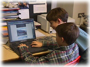
Photo by Betty Trummel, Husmann Elementary in Crystal Lake, Illinois.
Suggestions
General Comments
Determine your target audience and scope.
 General public - information about your research
 K-12 teachers - educational resource relevant to your research
 K-12 students - educational information about your research
General Public
Teachers
Students
A Few Models
General Public
National Snow and Ice Data Center Though the data products are targeted primarily for the science research community, NSIDC has compiled education resources for teachers, students, and the general public. Presentation and upkeep probably moderate in the required investment.
 Secrets of the Ice by the Boston Museum of Science. This polished general public site results from collaboration between the ITASE research community and the producers and educators at the BMoS. The site reflects strong content from the research side, and probably a considerable investment of resources from the Museum in the Web site development, illustration, and maintenance. "Live" sites such as this one require someone to work with them consistently.
  GLACIER Antarctic Earth science site that targets the general public. Most of the materials are written at an 8th grade level. The site is unfinished, reflecting a common problem in undertaking a sizeable project (patience is required). Moderate investment of funds and time in the development, illustration, and upkeep of the site.
 Leighton Taylor &
Associates Biologist and writer, Dr. Leighton Taylor, and NSF-sponsored nature photographer Norbert Wu worked together to document the underwater world of McMurdo Sound. Nice, concise, well photographed site for the public. Probably reflects moderate investment of time in the development of the site. A site like this requires little in upkeep and yet it can "stay fresh" for a year or more.
Leighton Taylor &
Associates Biologist and writer, Dr. Leighton Taylor, and NSF-sponsored nature photographer Norbert Wu worked together to document the underwater world of McMurdo Sound. Nice, concise, well photographed site for the public. Probably reflects moderate investment of time in the development of the site. A site like this requires little in upkeep and yet it can "stay fresh" for a year or more.TerraQuest Virtual Expeditions on the World Wide Web Includes Virtual Antarctica, a well illustrated, informative, interesting site for the general public. Design of a site at this level requires considerable expertise in graphics; the site can stand "as is" for several years.
Antarctic Philately Site A focused, comprehensive site on Antarctic stamps and the history of exploration. The site probably reflects a considerable investment of time in the design and maintenance but a moderate to small investment in the illustrations.
Graduate student Jerry Bowling posted images and journal entries from the field. More of a "for the folks at home" feel.
Antarctic Oceanography: A Research Expedition to the George V Coastal Region Bob Vaillancourt is sending journals and images every few days from the RVIB Nathaniel B. Palmer. Nice, simple. Basic data are reported. Materials are sent via e-mail and posted by another individual at the hosting institution.
Teachers
 Into the Arctic A site designed to offer instructional materials and activities for teachers to use in the many contexts of their daily teaching routine. Information and activities are divided into four sections: Climate, Climate Change, El Nińo and the
Greenland Ice Sheet Project 2. Navigation is a little challenging. The site probably reflects considerable initial investment in the development; it requires little in the way of upkeep as designed.
Into the Arctic A site designed to offer instructional materials and activities for teachers to use in the many contexts of their daily teaching routine. Information and activities are divided into four sections: Climate, Climate Change, El Nińo and the
Greenland Ice Sheet Project 2. Navigation is a little challenging. The site probably reflects considerable initial investment in the development; it requires little in the way of upkeep as designed.Students
 The South Pole Adventure Web Page The Center for Astrophysical Research in Antarctica teamed up with Science writer Janice VanCleave to develop a Web page wrapped around an expedition. Nice brain teasers and experiments for students. The site probably reflects moderate to considerable investment in the design and illustration; it requires maintenance to keep the expedition materials current.
Arctica A science mystery about a group of British explorers frozen into the Arctic in 1834. Presented by Access Excellence. Nicely illustrated, concise, quasi-interactive. The site probably reflects moderate investment in the design and more in the illustration.
Resources
New ideas, suggestions for changes, recommendations for additions, etc. always are welcome and can be mailed to:
There's No Place Like Home....